

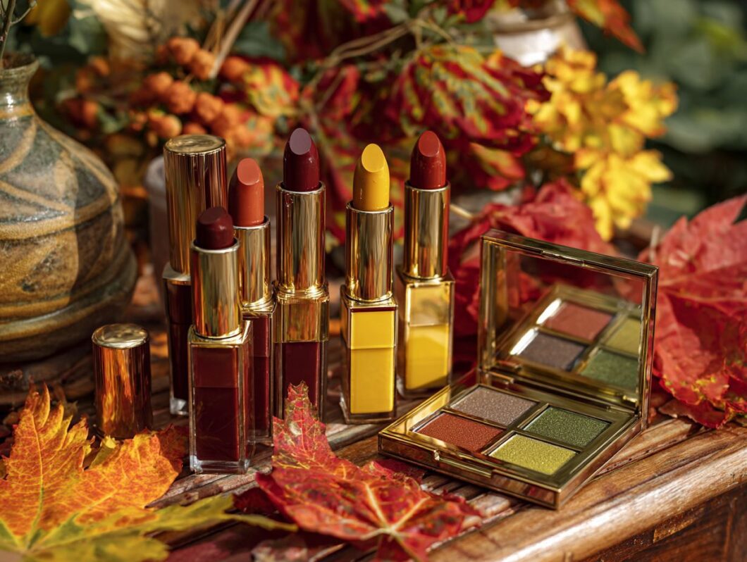
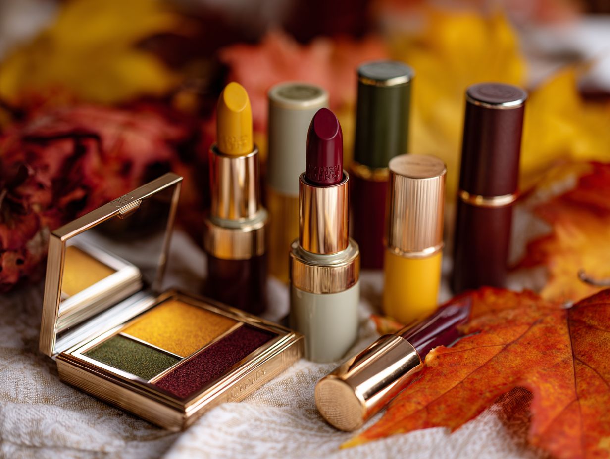
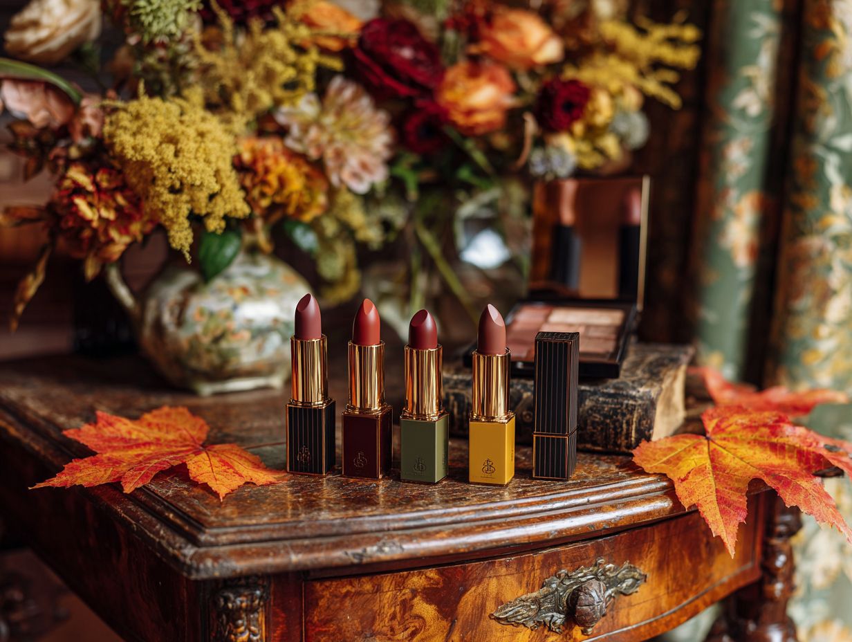
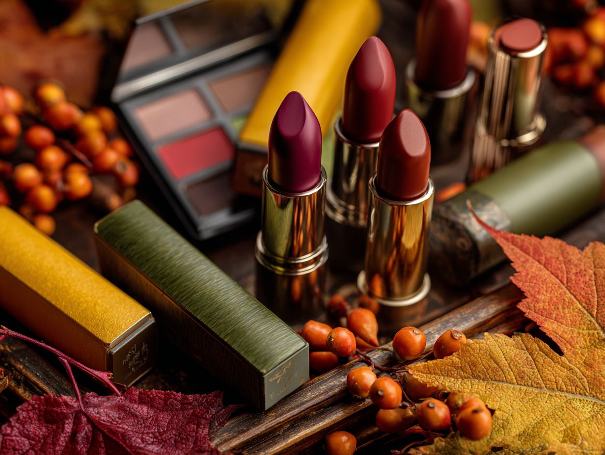
As the leaves begin to change, so too should our beauty palettes, reflecting the vibrant tones of the season. The right colors can elevate not only our appearance but also our mood, showcasing the aesthetic appeal of fall. In this fall preview, I’ll explore rich jewel tones like emerald green and deep sapphire, warm earthy hues like burnt orange and rusty red, and neutral shades that add depth. Join me as we discover how to expertly combine these colors for a stunning, cohesive vanity look that reflects the season’s splendor.
The Importance of Color in Beauty and Seasonal Beauty Trends

Color choices in beauty products, including trending palettes, play a significant role in influencing mood and perception. Research indicates that 85% of consumers base their purchasing decisions on color alone.
For example, red lipsticks often evoke feelings of passion and confidence, which is why they are a popular choice for evening looks. A perfect illustration is MAC’s ‘Ruby Woo,’ a shade that enhances features with its bold hue.
On the other hand, soft pinks, such as NARS ‘Dolce Vita,’ project warmth and approachability, making them ideal for daytime wear. Additionally, using cool tones like purples can convey creativity, as seen in Urban Decay’s ‘Vice Lipstick’ in ‘Rapture.’
By understanding these color associations, consumers can make informed selections that not only complement their features but also align with their desired emotional expression.
Rich Jewel Tones and Luxurious Tones
I find that rich jewel tones, such as emerald green and deep sapphire, add a luxurious touch to both makeup and interior design, making them essential for achieving a sophisticated fall aesthetic.
Emerald Green in Vanity Decor
Emerald green is a striking color that complements all skin tones and enhances the richness of any fall-themed makeup look, offering endless possibilities for color mixing.
To effectively incorporate emerald green into my makeup routine, I consider using products like the Urban Decay ‘Naked Heat’ palette ($54), which features stunning earthy tones along with a vibrant emerald shade.
For a more dramatic effect, I apply this eyeshadow to the outer corners of my eyes and blend it with warmer colors to create depth. Alternatively, I opt for the Sephora Collection Colorful Eyeshadow in ‘Emerald Dream’ ($10) when I want a bright pop of color.
In terms of home decor, I enhance my living space by adding emerald accents, such as cushions or a throw blanket, on neutral furniture. This approach effortlessly ties my decor together while creating an inviting atmosphere.
Deep Sapphire and Vivid Colors
Deep sapphire is a versatile color that can significantly enhance both my makeup and interior design, allowing for the creation of striking contrasts and unique combinations.
In my makeup routine, I find that using MAC Cosmetics’ ‘Sapphire’ eyeliner, priced at $18, beautifully accentuates my eyes. I like to pair it with a neutral eyeshadow to achieve a balanced look.
Regarding my living space, I choose sapphire blue cushions set against beige or gray furniture to elevate the sophistication of the room without making the color scheme feel overwhelming.
Draping sapphire throws over a neutral sofa adds warmth and texture, contributing to a cozy yet stylish ambiance.
This careful integration of color truly transforms both my personal style and my home decor.
Warm Earthy Hues and Cozy Aesthetics
I find that warm earthy hues evoke the essence of the autumn landscape, providing a cozy aesthetic that aligns beautifully with seasonal beauty and decor choices.
Burnt Orange and Blush Tones
Burnt orange truly embodies the warmth of fall, making it an excellent choice for both makeup and home decor that fosters inviting environments with cozy aesthetics.
In terms of makeup, I recommend:
- NARS ‘Matte Bronzer’ in Laguna ($40) for achieving a sun-kissed glow.
- For those seeking a more vibrant option, Urban Decay’s ‘Heat’ Eyeshadow Palette ($54) features a rich burnt orange shade that pairs beautifully with neutral tones.
Regarding home decor, incorporating burnt orange throws or pillows can significantly enhance the warmth of your space. These accents not only complement the fall season but also harmonize with earthy tones, creating a cozy and welcoming atmosphere.
By thoughtfully mixing these elements, one can effortlessly transform their look and living environment.
Rusty Red and Artisanal Beauty
Rusty red is a signature fall color that I find adds a dramatic flair to my beauty routine, serving as an excellent base for eye and lip looks.
To enhance my beauty looks, I incorporate Fenty Beauty’s ‘Stunna Lip Paint’ in Uncensored for bold lips, or I opt for Milani’s ‘Rose Femme’ for a more subtle blush.
For my eyes, the Natasha Denona ‘Bronze Palette’ provides warm tones that beautifully complement rusty reds.
I also pair these vibrant hues with warm neutrals in my home decor, such as beige or taupe accents, along with rustic wooden elements.
This approach creates a cohesive, autumn-inspired aesthetic, ensuring that both my beauty and environment reflect the season’s warmth in a harmonious way.
Neutral Shades with Depth and Color Coordination
I find that neutral shades with depth create an ideal backdrop for fall color trends.
They allow vibrant tones to stand out while maintaining a timeless palette.
Charcoal Gray
Charcoal gray serves as a sophisticated neutral that seamlessly grounds both my beauty looks and home decor.
In terms of beauty, I find that products like Maybelline’s ‘Eye Studio’ gel eyeliner, priced at $10, allow me to create striking yet understated eye looks that align perfectly with a minimalist aesthetic. Additionally, using charcoal gray nail polish from OPI, available for around $12, adds a chic finish to my overall appearance.
Regarding decorating, I prefer to pair these hues with sleek furniture and simple textiles to enhance a modern design. For example, incorporating a charcoal gray throw blanket not only provides warmth but also keeps the space uncluttered.
This approach results in a cohesive look that effectively balances beauty and interior design.
Warm Taupe and Chic Palettes
Warm taupe is an understated yet elegant shade that I find perfect for creating a subtle and inviting palette in both beauty and home environments.
In terms of makeup, I highly recommend Tarte’s ‘Tartelette In Bloom’ palette. It features warm taupe shades that are ideal for crafting layered looks, effortlessly transitioning from day to night.
Regarding home decor, incorporating warm taupe into furnishings-such as plush cushions or accent walls-can beautifully enhance contrasts with brighter color elements. I often pair it with crisp whites or deep blues to achieve a balanced aesthetic.
For paint, I consider using brands like Benjamin Moore for their versatility, ensuring that the warm taupe remains a focal point while allowing other colors to stand out.
Combining Colors for a Cohesive Look and Color Coordination
Mastering the art of color combinations can significantly enhance both my beauty looks and home decor, creating visual harmony and impactful aesthetics this fall.
Accent Colors to Consider: Complementary Colors
I consider incorporating accent colors such as mustard yellow and forest green to create vibrant, eye-catching contrasts in both beauty and decor during the fall, inspired by color theory.
In makeup, I recommend using mustard yellow eyeshadow to craft bold, sunny looks that brighten the eyes during the cooler months. Pairing it with a deep, forest green eyeliner enhances the overall definition.
For nails, I suggest opting for a forest green polish to achieve a sophisticated, seasonal touch, while also considering mustard yellow nail art designs to introduce playful details.
In terms of home decor, introducing mustard yellow throw pillows on a neutral couch, along with forest green accent pieces like picture frames or vases, adds depth and warmth to the space.
These elements work together to create an inviting atmosphere throughout the season.
Final Thoughts on Your Fall Vanity and Seasonal Style
As I embrace fall, I recognize that the right combination of colors can significantly enhance both my beauty routine and home decor, creating a personalized aesthetic that aligns with the season, guided by trending colors and fashion-forward palettes.
To effectively select my fall color palette, I consider rich hues such as deep burgundy, burnt orange, and muted gold. In my beauty routine, I find that a burgundy lip paired with warm bronze eyeshadow results in an inviting look. For my home decor, I incorporate plush blankets and cushions in these colors to create a cozy ambiance.
I utilize tools like color wheel apps to visualize combinations and explore Pinterest boards for fresh inspiration. Ultimately, blending these tones allows me to express both the charm of the season and my personal style.
Frequently Asked Questions and Beauty Must-Haves
What are some popular color palettes for fall on the vanity?
Some popular color palettes for the fall season on the vanity include rich jewel tones like emerald green, deep burgundy, and golden mustard. Bold and warm colors like burnt orange and deep plum are also on trend.
What are some ways to incorporate rich colors into my makeup routine for fall?
You can incorporate rich colors into your makeup routine for fall by using eyeshadows, lipsticks, and blushes in deep and vibrant shades. You can also try using colorful eyeliner or experimenting with ombr looks using different shades.
What types of products should I look for when creating a rich color palette for my vanity?
When creating a rich color palette for your vanity, you should look for products with highly pigmented formulas and a variety of shades that can be layered and blended for a bold and vibrant look. Cream and powder products are both great options for achieving a rich color palette.
Are there any specific brands that are known for their rich color palettes for fall?
Yes, there are several makeup brands known for their rich and vibrant color palettes for fall. Some popular options include Anastasia Beverly Hills, Huda Beauty, and Pat McGrath Labs. These brands offer a wide range of bold and pigmented products perfect for the fall season, reflecting the latest makeup trends and fall-inspired looks.
Can I use rich color palettes on my everyday makeup look or are they only for special occasions?
You can definitely use rich color palettes on your everyday makeup look. While they may be more commonly associated with special occasions, you can still incorporate bold and vibrant shades, deep shades, and warm hues into your daily routine for a fun and unique look. Don’t be afraid to experiment and have fun with your makeup!
How can I create a cohesive look using a variety of rich colors on my stylish vanity?
To create a cohesive look using a variety of rich colors on your stylish vanity, you can either stick to a monochromatic color scheme or choose complementary shades to create a cohesive look. You can also use a neutral base and add pops of color with a bold lipstick or eyeshadow for a balanced and put-together look. Consider using color swatches, color layering, and color matching techniques to harmonize your palette, creating beautiful arrangements with enticing combinations.